Wednesday, 5 September 2012
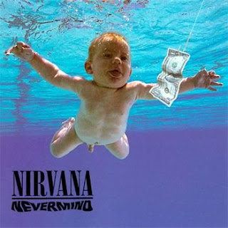
Album Cover 3
These album covers are hip hop style and I like how they use centre colours which blend together and make the main feature like someone's face stand out. I like the baby cover as it works really well with the title of the album 'never mind', as it shows a baby in water trying to get money which is a very unlikely thing to happen. I love how the blue colours used for the water really stands out behind the baby and looks so realistic. I also like how the titles of the artists are in the corner of the page or not to big so the main focus is the picture.


Labels:
A2 induction
Subscribe to:
Post Comments (Atom)
No comments:
Post a Comment