These covers are all different but they all stand out to me. I love how simple and plain Rizzle Kicks album cover is but it describes them straight off and the style of music they play, they don't put on a front they like to keep things simple and straight to the point as that's the type of people they are and the style of music they like. I also like the Frays album cover as it focuses on the light that spells the bands name but they have done editing to the people working past it to make them blurry and fade into the background which really crabs my attention.
These album covers are so bright and colourful they describe straight off the type of music being played on the album and the kind of artist the music is coming from, for example, Mika his album cover is very bright and playful which connects to his style of music it is all up beat and child like, this is good as it reaches out to a wider audience. I also like the Kanye West album cover as its very simple and gets my attentions as it has a heart and makes me wonder what his albums all about, which makes you want to buy it and find out.
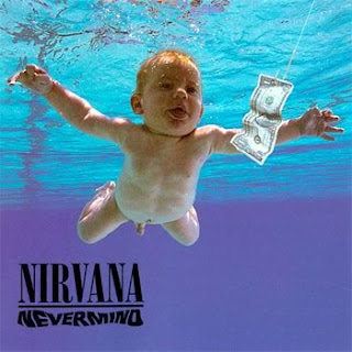
These album covers are hip hop style and I like how they use centre colours which blend together and make the main feature like someone's face stand out. I like the baby cover as it works really well with the title of the album 'never mind', as it shows a baby in water trying to get money which is a very unlikely thing to happen. I love how the blue colours used for the water really stands out behind the baby and looks so realistic. I also like how the titles of the artists are in the corner of the page or not to big so the main focus is the picture.
These album covers as more up to date which is the kind of artists that are out now. I like the close up shot of just using the artists head in the shot as its simple and it focuses more on the artist them self than looking at anything in the background. The colours used are varied in each cover but they all bend together. I like T.I album cover as it uses his face on the cover but instead of a straight forward picture, they use different parts of materials to make his face come through onto the page. This is very clever and will get the attention of the audience. The covers used on this page also describes the type of album the artist is going for by the lay out of the cover and the colours used, as Rihanna uses black and white which shows darkness and the way she is shown shows the same genre. This connects to her music in this album.
These album covers are history of the old bands and singers that began to create music in the 60's to 80's. I like the look of the Beatles abbey road shot they used for their album cover, as it is very simple but it has been noticed by many other artists and the public which brings them more fans. The colour used is very simple and plain but it gets your attention, also where its set in London gives the album more of an appeal to a wider range of audience. It isn't a staged picture its just them walking across and zebra crossing and taking a picture whilst they walk which is a easy shot to get. I also like the other album covers on here as they are the start of what the artists in the 60's and 70's looked like and you can see the difference. Artists today still use some of these album ideas but do them in a slightly different way, as it is history.