Saturday, 3 November 2012
Film Planning 4
Today I will get a few group shots done that need to be filmed inside in my garage where they aren't moving around to much and finish off Alex's and Becky's recording too. Each girl is dressed in something different from the other shots and I have put them together with Alex in the middle because she is blonde and the other two are brown and are also wearing leather jackets. I will change them around when doing other shots as in the band they are all equal so they'll all get their place in the lime light. I will also get some extra shots of the girl painting and dancing for shots that will be in my music video as they wont be singing all the time. I am using the camera from the school again and the tripod as I have brought them both home as I made sure all the girls were free to do it tonight.
Friday, 2 November 2012
Planning 3
Today I will be meeting up with Becky and Alex to film their individual shots as I have borrowed the camera and tripod from the school library and have took it home over the holiday as I want to use my time wisely. Becky will be wearing her green baggy to with leggings and leather jacket. I will be shooting Becky's shots on the green behind my house on the brick wall as this will be her background for her character. I will try get get half of her shots done today so I only have to meet up with her one more time. Alex will be wearing leopard print leggings and a black vest top as this is a bit different to the other two and stands out. I will be shooting Alex's shots in my garage on the background I have paint for her as I want each member from the band to have a different background so viewers will remember who they are when watching the music video over. Im hoping to also get half of Alex's shots done today, leaving me less shots to do next time I see them both.
Wednesday, 31 October 2012
Track List
This is the playlist I took my inspiration from to make my playlist for my digipack. This is Demi Lovato album 'Here we go again'. I took some of the songs from her playlist as they work well with the image im going for and relate to the girls im using. I took the song im using for my music video from the band 'Little Mix' as its a new song that has be realized in the charts and it got my attention because of the style of the video as its up beat and happy with simple but fun out look on the music video. They are a new band and thought it would be a good song as everyone would of heard it before and be excited to be part of making my music video.
Shots For Digipack And Advert
These are the shots iv taken of Beth. She is one of the members of the band and this is the background I have been using for her throughout the music video. This are a few photographs that I might include in the making of my digipack and advert. I will do some more shots that best fit the style I want as after taking these shots iv relised I want each girl to be on the same background for my digipack as this will stand out and work well together.
I like this photograph inparticulary because it is a posed position and looks quite fashionble. It is also portrait which would fit well with the advert im doing as im using all three members with different background so I think this style photograph would work well and also fits with the genre of the music video.
I also like this one as the distance of the photograph stands out as you can see more in the photo but you cant see her features as well because it isnt as close. It is a landscape photo which might not fit into the style im going for on my advert.
I also like these two as there the same shot but ones landscape and ones portrait. I think the portriat one works better and would fit my advert better than the top one. The colour is also brighter on the bottom photo which works well with the style im going for.
These are a few shots iv taken of Alex, who is one of the members of the band. Here I will show a few photographs I have taken of Alex for the digipack and advert. I will take more if needed as these are just a few test shots to see what looks the best.
This pose Alex is doing I quite like I think it would look good in the digipack as its lanscape so it couldnt really be used on the advert as it would need to be portriat.
These are the shots I have taken so far for the front cover of my digipack. I will be taking more if these dont keep to the standards I want for my front cover as I want it to be bright and best describe the band.
I like this one as you can see their facial expression very well and shows how close they are. It would work well on the front cover but maybe there isnt another movement for what I want.
This photgraph is different as Beth is shown in front of the other two members of the band and I think it works well as it isnt usually used on album covers so its different to other artists. The only thing I would change is their facial expressions and some are posing their faces and Beth is smiling so they would all have to be doing the same thing.
This is my favourite photograph iv took so far of the band together as they are all posing with their bodies which makes the photo look more interesting and catches yours eyes. Also its a higher shot so you can see more of them.
Advert Feedback Analysis
I got quite a bit of feedback for this piece of work, but nothing to negative just improvements. The photograph I have chosen for this page works well with the genre im using for the music video but the only worry is will I be able to keep it up to this standard. I will try my best to get it to the best standard as possible to get the best grade I can so some elements will have to be included when thinking about how to make this happen. I will think about the sort of clothing I want my girls to wear that best shows their individual styles and what looks the most fashionable. I want the photos to look good quality so I will add effects if needed to give extra brightness to it.
I have took a few photos already and the idea I have of three individual shots of the girls and them putting them together could be a good idea but it will need a lot of work done to make sure it comes out right and looks professional. I have already took photos of two of my members with different background and I think they look quite fashionable but I might need to rethink the style im going for as it really needs to link back to my digipack style as the two products have to look similiar so the target market know who they are. I will use different outfits in the photographs and see what looks best so then I have more of a range to chose from.
To make sure the advert looks as professional and believable as possible I will have to add all the finishsing touches which includes extra text at the bottom of the page including their twitter account so viewers can follow them as well as their facebook and officle website address so everyone can access them. I will also have a record label and logo shown at the bottom of the page. I will experiment with the postitioning of the additional text, but for now I will stick to the font I have already used on the digipack and the size im thinking of using. I dont want the additional text to be to big as the main text, for example the names of the two new songs need to stand out compared to any other text on the page as this is the most important information.
I could also add the ratings from a magazaine which realtes to the target audience which could be Pop or heat magazine parhaps, I need to do some more research on this particular part. I do believe that the additional text could make the page look over crowded and take the main focus away from the page so I have to try and keep to a quite simiplictic approach. I will also show the data the album is out which is another big part of information that will be shown in a bigger font to the other text. All the extra information im adding to the advert will make it look more genuine which is one of the most difficult parts to create and make it believeable.
I will use the fonts I have chosen to use on the digipack on the advert as well as this will relate both of the products back to each other which will make it easy for the viewers to know whos album and advert their looking at. To improve the copy from above I will make sure the text is lined up together and looks neat and tidy on the page. I am happy with the text font and the sizes iv used but when adding the additional text I might have to make some of the text smaller just to be able to fit on to the page and keep it look neat. I like how iv positioned it but it could become bottom heavy once iv added the additional text. I will do experiments with where to put the text until I find the perfect position for it so the final design looks to the stand I want.
Digipack Feedback Analysis
The feedback I got for my digipack was mostly positive but there were a few things that were brought up. I have used images off the internet as I havent taken pictures yet but ill be taking my own photos soon of my band members, so I will have to try keep the same style and mise en scene when it comes to my own images. I want to make sure my images are as good quailty as the ones iv picked from the internet and makes sure their suitable for the genre iv chosen. The models im using for my girl band will have similiar outfits to the girls shown on my draft digipack, but they might not be agsact as the people im using might not have the clothes I first want to use. However i will make sure there pretty close, so hopefully they will look the part giving a genuine believable image.
I would like to recreate the image of the girls being close together and some individual shots for the other sides to make it more interesting. I need to take many shots to see what best fits the style i want to use for the band. I would like to do this as it links into my music video locations as well. The cover image I have found and put onto the digipack I personally like but when it comes to my own cover picture it would be as bright and professional as this. I will try my best to make it look similiar as I like the style and it would fit the genre im doing. I will keep to a colour scheme so it all relates back to each other and isnt hard to look at. The covers inside will have an individual image of each band member on each panel with the same style as the front cover so it connects throughout.
IMAGE
My backgrounds are going to be all the same on the digipack because I got feedback on how the draft wasnt linked together and each panel felt disjointed from the rest, so ill make sure each picture I take will use the same background and colours so they all relate to each other. I will also use the same colouor scheme thoughout the album as this will link it all back to each other and will be easy for the target market to see and understand.
TEXT
I forgot to add the two main songs that were featured on my advert onto the digipack song list, so ill have to remeber to add them and make sure theres 12 to 14 songs as thats the amount a Pop genre would have. The feedback I got for the fonts I used on the digipack were positive and connected well with the genre of the video and the girls im using. I will keep to the font style throughout the digipack and also onto the advert as this will connect well together and make it easy for the target market to know who they are.
Monday, 29 October 2012
Digipack Ideas
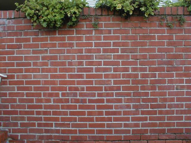
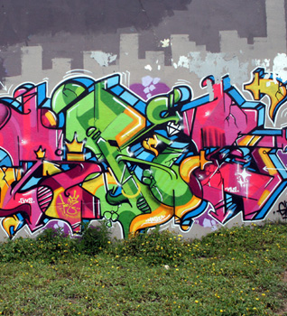
These are a few images that I want to include as backgrounds for my digipack and advert photo's. I want my music video to relate back to the original Little Mix 'Wings' video as this is my main inspiration for my the type of video im wanting to do. When it comes to the genre im doing I need to use the right style backgrounds that stand out and best fits the people im using to as this is another key factor I will need to think about when it comes to the pictures i take. So far from recording I have used these backgrounds for individual members of my band and this will relate well with the digipack and advert.


I chose a brick wall as a background as its simple but effective. This works well with my genre because its Pop and the person I used on this background stood out against it as her outfit is bright and also her make-up was natural and light. A picture on this would work well but I wouldnt use it for a front cover as I want something more stricking that will grab my target markets attention.

I also chose this background of graffiti as this reminds me of Pop music videos and the style of the genre im doing. I used this background for one of the band members as each person had a different background so the audience know who's, who. Also it uses bright colours and the person I used wore a bright top and jeans with natural but light make-up the same as the first person as this got the best look of the genre of the band. I think this background could be used for the digipack and advert but I think its a bit messy and its hard to get to for two of my band members so this idea couldnt work.
Ideas For Album Cover
Just to get an idea of what I might want my album cover to look like I have done a few quick mock ups on Photoshop, using photos from the internet and adding my band name to the cover to attempt to create something similar to the album artwork I want to use. These are two of my favourite pictures that would best fit the sort of genre and look im going for on my album cover and the type of font I might use, which allows me to see what font would work best with the style im going for.
I firstly crearted a quick mock up taking inspiration from Demi Lovato's album cover which I saw on the internet and thought it would fit the colour scheme I would like to use on my album cover as it best fits the genre im doing and also represents the girls in the band. Then I picked the type of font I liked and put it on the top of the photograph quite big to get the target markets attention. Iv positioned it at the top because this is one of the places I am thinking of putting my heading and this allows me to see what it might look like. I think the font and picture work well together but looks a bit plain.
Secondly, I took another photograph I thought could fit the style im going for. This photograph is different as there laying on the floor with the camera above them which is a good idea for a cover but could be hard to do as i dont have the equipment to do this shot. I like how close the girls are which is a big part of my video as I want the audience to connect to the girls. I positioned the bands name differently this time to see what else I could do with it to make it stand out more and I think this lay out works well but I might have to keep moving it around untill I find the perfect position. I also changed the font style as this was my second favourite and I think it works well with the photograph.
Subscribe to:
Comments (Atom)


