Friday, 26 October 2012
Film Planning 2
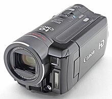
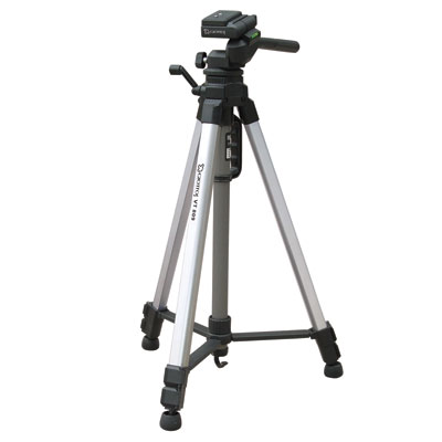
Today I have chosen to do another section of the filming I need to do with Beth. I will do another minute of filming with her as she plays two parts in the music video so im doing the second person as I did the first one last time with a few extra shots for the video. I will be using the camera and tripod again and will be filming in the same location as I did before but I will give her a different background just to give it a different feel and make it more interesting. She will be wearing something different from last time as she is acting as another person. It is being filmed in the Lutterworth area again in school time as this is the best time to do it with Beth as she comes to the school when the other two of my band members don't. I will be doing close ups, mid shots and miming today and also some dancing to give some life and excitement to the video.
Magazine Analysis- 3

This advert iv picked is completely different from the other two I have analysed. The first obvious difference is the layout and font style used. The title is positioned in the top left hand cover and is separate from the image itself. The titles meaning links well with the photograph being showed as its elsewhere, therefore a bomb or casualty could be happening somewhere else and we don't even know about it. This could relate to the album itself as it could be a hint to what the songs are all about. I like how creative this photograph is as it gives some meaning to the cover and makes you wonder what its all about as the front cover is interesting and eye catching because of the colours used and also the drawings that are included in the photograph. This photograph doesn't really relate to the type of genre im doing but I found it interesting to look at and different to other adverts you find. It doesn't use much information on it but this shows how simple an advert can be and still be effective on the viewers. At the bottom of the page its quite plain and simple, using blacks and whites for the explosion that then floats into the air and opens up with all these different colours and drawings of various objects that people use to harm one another. The back ground is a plain light purple colour to make the main focus of the photograph stand out.
The font used for the title is clear and simple which connects with the picture as its simple laid out but in the main photograph it is very busy and uses many different pictures all in one. The font is kept simple as its vital for the reader to be able to see it as it gives them the name of the album. I will make sure that on my advert all my information will be clear and easy to read. This advert uses no data's or numbers or any extra information except the title as I think the artist/artists wants to get their name across and if the reader likes what they see they should just go buy the album straight away with no inside knowledge of what's going to be in the album. I personally would put a bit more information on the advert so the reader knows more about the new band im making, because as a new band you need to get your best look and information across to the audience before anyone knows about you properly. This advert is a risky move and it wouldn't be something I would consider doing at this stage.
I prefer an album cover or advert that uses a photograph of my band members, however this works well for this artist. The elements used in the photograph work well with the genre of the artist which is Funk, alternative Hip Hop and alternative Rock. They include particular words in the photograph that connect back to their album which I think is a good idea as it incorporates all parts of the advert and is a clever way to get across to the reader.
Magazine Analysis- 2

This magazine advert is for the release of Jessie.J's "who you are" album. On the advert she uses gold for her lettering as this is also shown on her album cover so she is carrying it across from her album onto the advert so it gets across to the audience better. By doing this it'll make it easier and quicker for viewers to know what their looking for when it comes to Jessie.J's as this is her style. I do quite like the font positioning in the middle and bottom half of the page as I would either want to place my title in the middle or top of the page as I think it gets the most attention in these two places. This would be ideally when coming to make my magazine as it allows the middle section to be used for the main image allowing plenty of space. The sizing and font style of the title is very striking as its quite big and shown in gold like she's wearing it as a necklace. Then slowly the writing gradually gets smaller giving you extra information about the artists new album and what you'll find in it. Each bit of information is separated by a white line which makes the advert look neat and organised. I think the simpler the advert the more effective it is to the audience. The use of heading explaining what each of these songs names mean allows the viewer to know what hits she's had so far. This will allow people to download these songs as they have already been in the charts or are coming out soon so people get a head start, leaving them with higher numbers of downloads. These fonts being used are found throughout Jessie.J's music so the fans already recognise her when she's being advertised, as this is her trademark font.
The main image on the page is a simple photo of Jessie.J. She is shown looking straight into the camera whilst she's singing and showing some kind of movement which makes it interesting to look at. This picture best describes Jessie.J as she's an outgoing person with a mixed of taste in music, but when she first came into the music business she was a little chavy and mainly focused on R&B which is shown by the clothing she's wearing and the style of make-up she's wearing. Her make-up is quite full on as her eye shadow is black and her lips are dark black to with a gold design on the left side of her lip. This all relates back to the colour and style font she uses on her cover as she likes to show her music through her album cover or magazine advert so its simple for the viewers to see what kind of artist she is. I like the connection made throughout the design and would be something I would attempt to do with mine and would like to try a landscape picture with all my band members in it. By using a dark Mise en scene it allows the text to stand out, also using a dark colour palette for the photo gives it a simple and effective look. My opinion taking inspiration from other album covers works well as it will allow new fans who haven't heard of my band before to recognise them through other peoples designs that relate back to mine. I was thinking of taking inspiration from a few different artists that work well with the style im going for. For example Rihanna's, Demi Lovato's new covers are bright and simple but show real photographs which is an element I would include when it comes to my advert.
The main image on the page is a simple photo of Jessie.J. She is shown looking straight into the camera whilst she's singing and showing some kind of movement which makes it interesting to look at. This picture best describes Jessie.J as she's an outgoing person with a mixed of taste in music, but when she first came into the music business she was a little chavy and mainly focused on R&B which is shown by the clothing she's wearing and the style of make-up she's wearing. Her make-up is quite full on as her eye shadow is black and her lips are dark black to with a gold design on the left side of her lip. This all relates back to the colour and style font she uses on her cover as she likes to show her music through her album cover or magazine advert so its simple for the viewers to see what kind of artist she is. I like the connection made throughout the design and would be something I would attempt to do with mine and would like to try a landscape picture with all my band members in it. By using a dark Mise en scene it allows the text to stand out, also using a dark colour palette for the photo gives it a simple and effective look. My opinion taking inspiration from other album covers works well as it will allow new fans who haven't heard of my band before to recognise them through other peoples designs that relate back to mine. I was thinking of taking inspiration from a few different artists that work well with the style im going for. For example Rihanna's, Demi Lovato's new covers are bright and simple but show real photographs which is an element I would include when it comes to my advert.
Magazine Analysis- 1

I chose this advert because it was difficult to find any adverts that were good to analysis online, therefore the advert above my not be the right style or genre of the one I might like to create. However I like the way the picture is laid out, as it takes up the whole page allowing the audience to know who the adverts about which is the main aim of my magazine advert. I also like the how the information on the page is shown at the bottom in small writing to allow a large portion of the page to be specifically for the image. I do not like the yellow font used for the title I would particularly use it for my advert as it wouldn't fit in with the genre im going for. However with this genre the lettering works very well with the artists name and data's also information for the act which gives the advert a dramatic effect. By using minimal writing on the page it keeps it looking organised and not to busy to the eye which is an important factor when it comes to making a advert as it needs to be easy to read for the viewer as well as them being able to get information easily and quickly.
The main image of Gwen Stefani works well with the colours scheme of the page as its all whites and creams and a bit of yellow giving it a water paint effect that is unfocused as its slightly blurred around the edgy's of the painting. This style of artwork works well with the genre and the content of the songs on the album. The pose shown of her in the picture best describes her and the style of the album as she is shown as a queen on a thrown with a crown but really all she wants to do is party which is shown by the red lip stick and red behind her showing a different side to her. The text on the page blends in very well as it goes with the colour scheme and shows to be visible highlighting the main information being shown on the page.
Album Artwork Analysis- 2
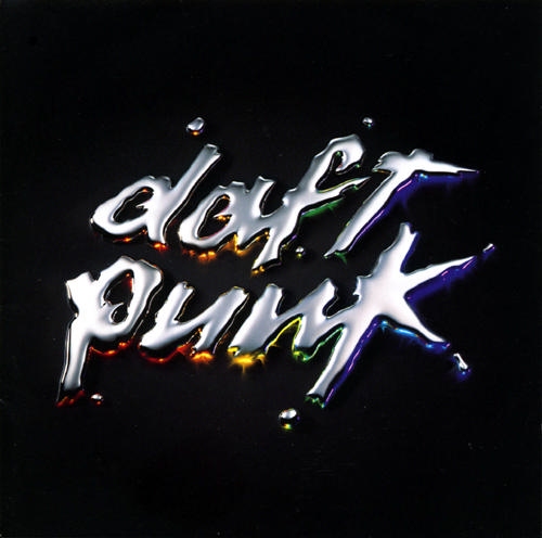
This is the album artwork for Daft Punk discovery which was one of their album covers. I chose this piece of artwork as its very simple to the eye but I like the two layers of colour on each individual letter of the title. Seeing I want to use a lot of colour on my cover this particular piece of artwork stood out to me, even though its a small amount of colour being used it still stands out and gets my attention. This artwork shows that the album is all about colour and originality as the band members aren't shown on the front cover which is normally used on band covers. I like this idea but I do think it looks a little plain but works well with the sort of genre of music they do. Daft Punk is electric music that is also known as house music which goes well with the lettering font as its static like its moving on the page as its blurry like its electric and slowly moving into different shapes. The background of the picture is black but lighter around the title which shows the letters being very bright and makes the bands name stand out even more. I think this all contributes to the cover looking sharp and edgy which is done by the editing making the words glow on the page and the small amount of colour under the letters blasts out giving it a electric feel. As the genre of the band is electric you would expect to see something bright and illuminous on a dark background so you can get the whole affect of the feel of the electric music. The colours of the letters contrasts with the black ground and that makes the colours stand out more from behind the letters which makes it eye catching.
The bold, but very edgy look of the band name goes well with the electric effect we see going on in the over all photo. This gives an impression that the title has been done recently on a moving object like speakers as the font of the title looks shaken and wobbly like its been made this way to get the best effect. The name of the band is shown in the middle of the page as there are no other images on the page so this is the main feature which is shown quite big so it'll get the audiences attention. This technique could be hard to do unless you do it right but I like the idea of it as it would fit in with the style im going for.
Overall I find the album cover very inspirational as it shows me how to use colour on a page to make it get the best effect and make it come across to the audience well which I might include when making my digipack.
Thursday, 25 October 2012
Fonts
I have chosen this font because it uses bubble lettering which I find interesting and it stands out and look very girly which would fit in with the genre im doing and the type of girls im using. I also like the shaping of the letters as there different and I like the love heart dot for the 'I' as it doesn't show up on other album covers in this genre so it would make my band stand out more. Im not to keen on having no colour in the title as I want it to be bold and bright so this might not work for my design.
I have also chosen this font that is the same as the one above just filled in, in black because it stands out more compared to the other one to me and I like the style of the letters they would fit the genre im doing as well as the band style im going for. The shape of the letters are different and I particularly like the love heart dot for the 'I' as it connects to the personalities of the girls im using for my girl band and the relationship they have. i would change the colour of the letters though to a bright colour to fit with the Pop genre.
I chose this font because I like how the 'T' and the 'L' stand out as there is capital letters and the rest are in lower case which shows the bands name as being important. Also the bold black letters get your attention and would stand out to the target market im going for. The shaping of the letters is eye catching and are positioned neatly which I like when it comes to writing. This font could be used for the album title and magazine advert.
I chose this font because I thought it was a bit different to the others I had picked and I wanted to see if this could fit in with the genre and girls I have chosen for my band but I don't think it will work as it reminds me of comic book writing and it wont fit in with the style im doing for my band. I do like how they make each letter a different size which makes the font stand out but its very kiddy I think.
I chose this font as I have used it before and I thought it would have a good effect of the target market im going for. I like how its all one size and lines up together making it look neat and not messy like the one above. I also like the bubble style look it has to it, this gives it a girly feel and relates to the band members personalities which is vital when it comes to showing who they are on album covers and magazine adverts.
I chose this font as its very girly because of the style of the lettering and the lover heart used for the dot on the 'I' this would look good on my cover and would best describe the band. I like the 'G' as its different to any of the other fonts and fits best with the style and genre im using for my band. This is one of the fonts I am considering to use when it comes to my final design.
I chose this font randomly as it reminds me of comic books and the kind of style that would be thought when you say the word lazer lights but I don't think it will fit the genre im using and the band members im using to as it doesn't best fit their look and personalities, it wouldn't look right on the front of their album cover or magazine advert.
Tuesday, 23 October 2012
Film Planning
Today I am starting recording for my music video. I am going to start with Beth as she comes to Lutterworth and the background I want to use for her character is in the Lutterworth area. I will be doing the first minute of my music video because of the weather as its cold and don't want to be outside for to long so I will split her filming into three different days. Each time I will get her to wear something different as they'll be many different shots of her because of the style of the video im doing. I will be using a camera and tripod to film her as ill be doing close ups and mid shots of her and need the camera to be stable at all times so I get the best quality shots as I possible can. I will be able to change the hight I want the camera to be in with the tripod giving me more options on what to do. Beth will be wearing a flower top and jeans with her leather jacket for these first few shots.


Subscribe to:
Comments (Atom)


